
Product Design Case Study
Problem Statement
Product
Mobile App
Duration
Sprint Project
Tools
Figma , Claude
Role
Product Designer
1
Context
Understanding the world behind closed doors
hikikomori
引きこもり · hee-kee-ko-mo-ree
Why this problem — and why now
1M+
30%
6mo+
0
Step 02 — Research
2
Research
What I needed to learn — and what I found
Secondary research across academic literature, clinical case studies, and first-person
recovery accounts — alongside a primary research plan designed around this user group's
specific need for anonymity.
✓ Completed
Secondary Research
→
Academic papers on hikikomori psychology, causes, and recovery patterns
→
Clinical case studies from Japan, South Korea, France, and Italy
→
First-person recovery accounts from online communities and journalism
→
Competitive analysis of wellness, social, and mental health apps
01
→ Zero-judgment tone
02
→ Interests-first onboarding
03
Recovery is a ladder of micro-
progressions, not milestones.
→ Micro-task architecture
04
The phone in their room is the only
bridge requiring no courage to
cross.
→ Mobile-first, room-first
05
Structure must come before
social — it is the prerequisite for
everything else.
→ Structure before social
Step 03 — Synthesis
3
Synthesis
From insights to principles — and a person
🪶
Principle 01
Nora waits — it never demands return or guilts
disappearance.
→ No guilt-based notifications
🌱
Principle 02
Solo features unlock before social features — always.
→ Self-discovery first
🎚️
Principle 03
Pace, challenge, visibility — all user-controlled, no fixed
paths.
→ No forced progression
🫧
Principle 04
Missing days produces no alerts, no red states, no judgment.
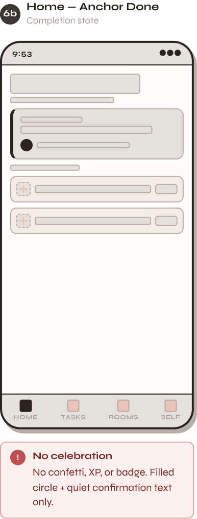
→ Remove all failure UI
🔭
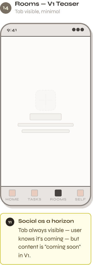
Principle 05
Social as a horizon
Connection is always visible ahead — never blocking the
path now.
→ Social features opt-in only
🕯️
Principle 06
Small is sacred
Two minutes completed beats ten minutes abandoned.
Always.
→ Default tasks under 5 min
Step 04 — Define
4
Define
Putting a face to the problem


5
Ideation
Generating ideas — then choosing the right ones
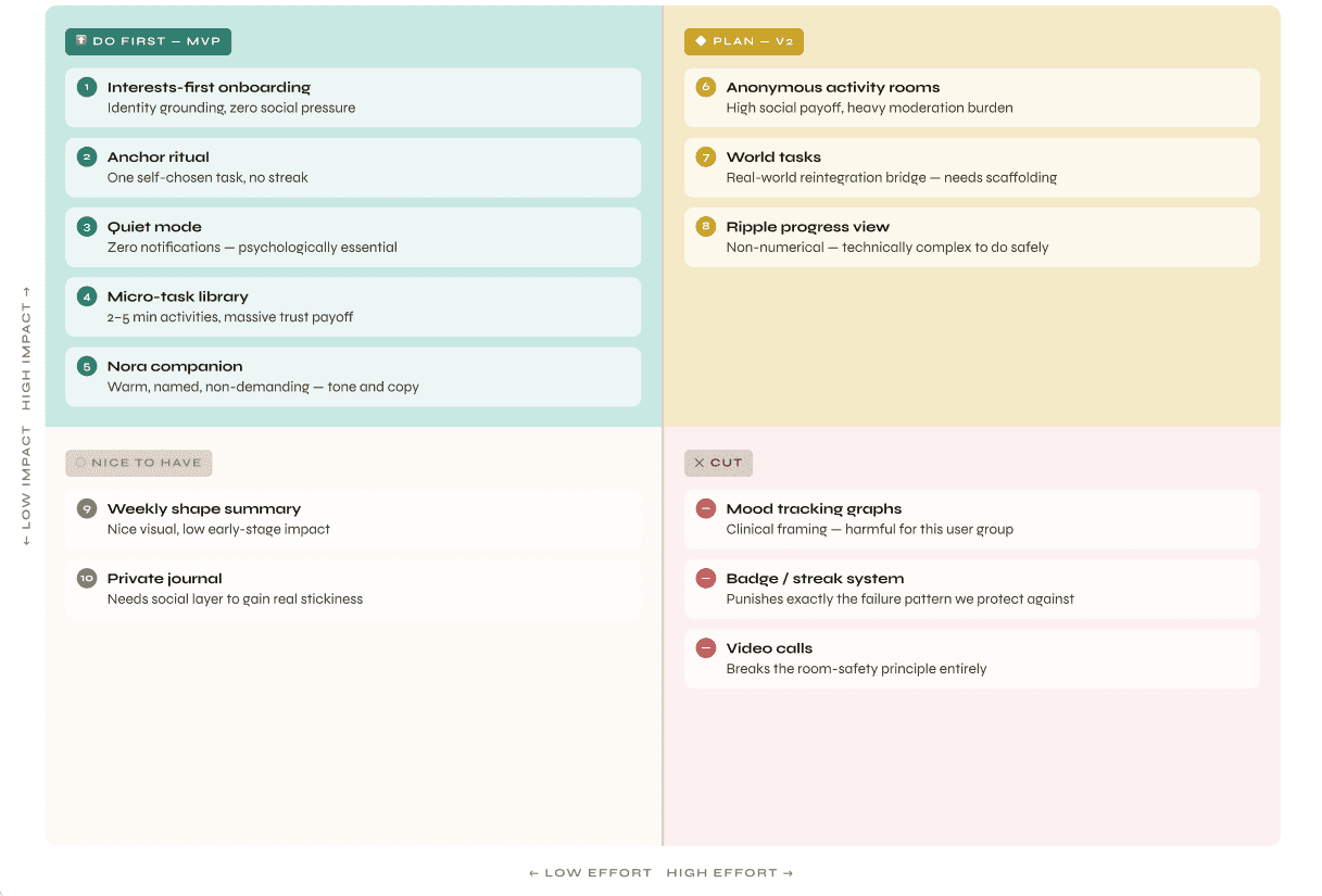

MVP Feature Set — 5 features, built around one constraint: never make Arjun feel like he failed
🌱
Interests-first
onboarding
Identity built before any social
feature appears
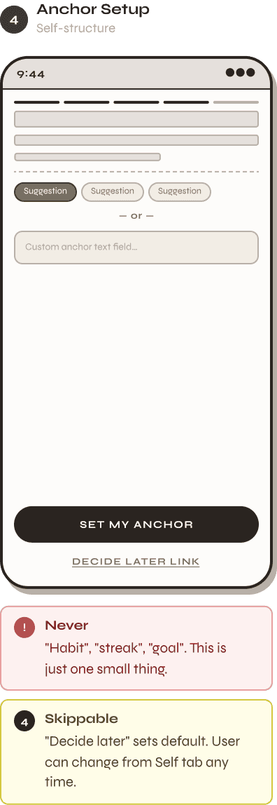
⚓
Anchor ritual
One self-chosen action — no
streak, no deadline
✦
Micro-task library
2–5 min prompts — skip always
visible, always equal weight
🫧
Quiet mode
Full silence — no notifications, no
guilt on return
🔭
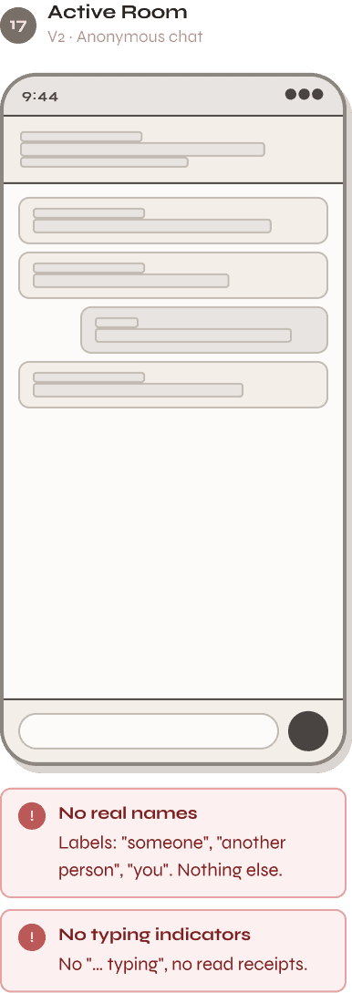
Activity rooms
Anonymous, interest-based social
spaces
Step 06 — Design
6
Design
From principles to pixels
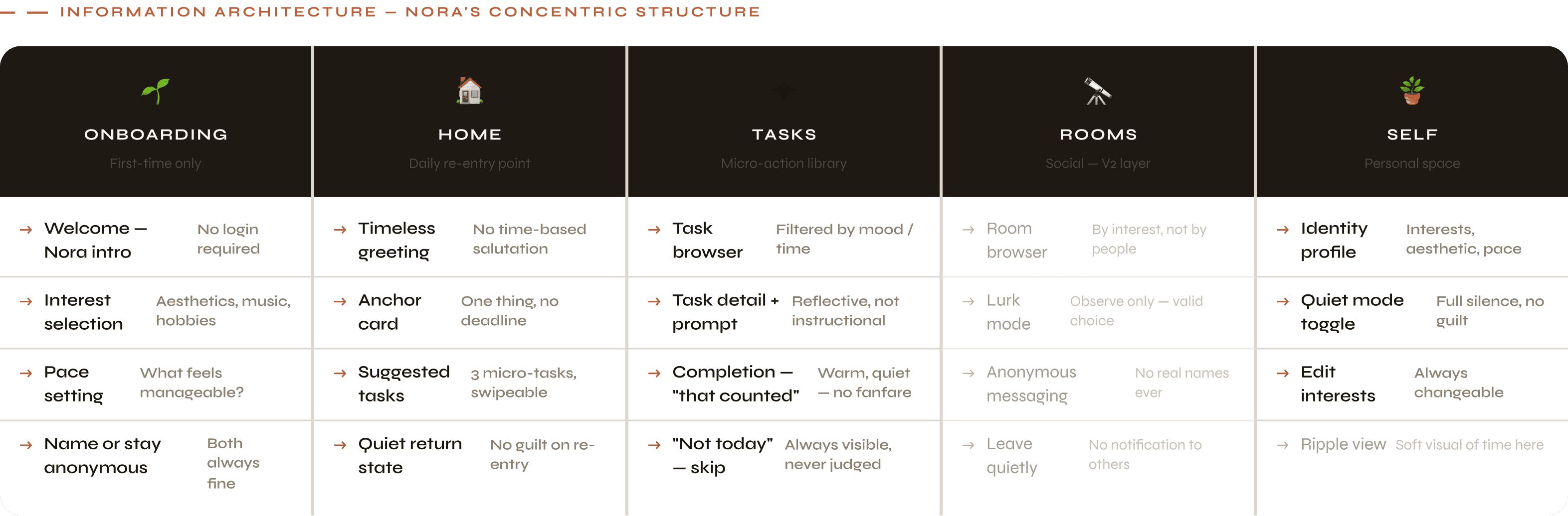
01


02
3 states · Identical every time

03
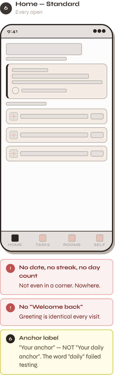
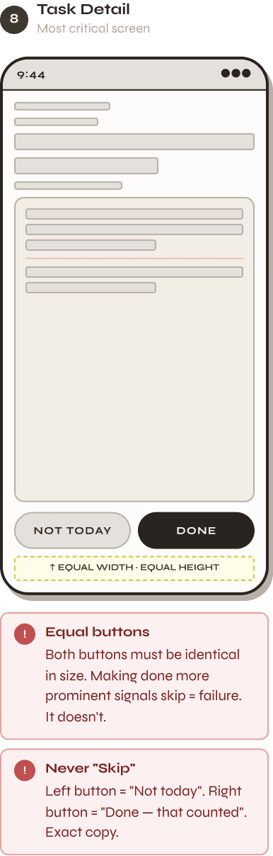
Task Flow
4 screens · Browser → Detail → Done or Skip


04
Self Tab
3 screens · Identity · Quiet mode · Edit


04
Room V2
5 screens · Social layer · Opt-in only · Anonymous


01 — Foundations
Design Tokens
Every visual decision in Nora is driven by a named token. Warm cream instead of white. Warm dark instead of black. The difference is felt even
if it can't be explained.
Colour Tokens
Rust
#C4623C
Primary · CTA · Active
Rust Light
#F5DDD2
Selected · Hover · Soft
BG
Rust Dim
#8C3E24
Pressed state
Rust Mid
#D4754E
Dark surface accent
App BG
#F5F0E8
Screen background
Card
#FDFAF6
Card surfaces
Ink
#1C1810
Primary text
Muted
#9A8E80
Secondary text
Border
#E8E0D4
Dividers · Borders
Dark
#1E1A13
Dark surfaces
Teal
#3A8C7A
V2 Social only
Teal Light
#D4EDE8
V2 Social BG
✓ Always
✓
Use #F5F0E8 (warm cream) for all screen backgrounds
✓
Use #1C1810 (warm black) for all primary text
✓
Reserve #3A8C7A (teal) exclusively for V2 social features
✕ Never
✕
Use #FFFFFF pure white for any background
✕
Use #000000 pure black for any text
✕
Use teal on MVP screens — its presence signals social
Typography Scale
Display
Cormorant 300 Italic
48px / lh 1.0
Nora
H1 / Screen Title
Cormorant 600
28px / lh 1.15
Your space
H2 / Card Title
Cormorant 600
20px / lh 1.25
Prompt
Cormorant 400 Italic
17px / #C4623C
"What did it become? Anything unexpected?"
Body
Syne 400
15px / lh 1.65
Small / Secondary
Syne 400
13px / #9A8E80
No schedule. No pressure. Just yours.
Label / Caps
Syne 700 Uppercase
11px / ls 0.14em
Your anchor · Creative · 3 min
Caption / Italic
Syne 400 Italic
12px / #9A8E80
Come back whenever.
Nav Label
Syne 700 Uppercase
10px / ls 0.08em
Home · Tasks · Rooms · Self
Spacing Scale
XS · 4
S · 8
8px — Icon-to-text gaps
M · 12
12px — Component padding
L · 16
16px — Card padding
XL · 24
24px — Section gaps
2XL · 40
Border Radius
4
8
10
14
20
∞
Shadow System
Card
0 2px 12px
rgba(28,24,16,0.06)
Float
0 8px 28px
rgba(28,24,16,0.12)
Button
0 4px 16px
rgba(196,98,60,0.25)
Icon Set — Navigation & UI
🏠
Home
✦
Tasks
🔭
Rooms
🪴
Self
🌱
Growth
🪶
Gentle
🕯️
Warmth
🫧
Quiet
⚓
Anchor
🎨
Creative
✍️
Write
🎵
Music
🕐
Duration
←
Back
→
Send
✓
Done
Real Protoype,
Interactive Prototype.
Real copy, real component structure, and annotated design decisions across all 18 screens and 5 flows. Mid-fidelity means structure and content are
finalised — visual polish comes next in high-fidelity UI.
5
Testing
What users revealed that research couldn't predict
5 participants, 5 task scenarios — 2 critical findings that changed the design, and 1 positive
finding that validated the core promise. Testing confirmed what worked and exposed what
didn't.


Reflection
↗
What This Project Taught Me
The things I learned that no brief can teach
Nora was harder to design than any utility product — because the margin for harm was much
smaller. These lessons will inform every project after this one.

